How to Capture More Leads From Your Website
Most websites don't have a traffic problem, they have a capture problem. Here's how to capture more leads from your website: forms, live chat, fast follow-up.

TL;DR
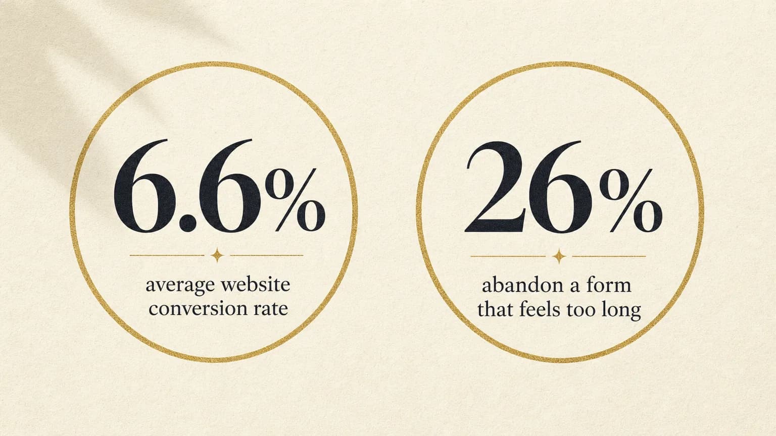
The fastest way to capture more leads from your website is to fix what's already broken before you add anything new. Cut your form to 3–4 fields and put it where visitors actually decide to act, not just the homepage. Add a live chat or WhatsApp option for the people who'll message you but won't fill in a form. And make sure whoever captures the lead follows up in minutes, not hours — because capturing a lead and losing it to a slow reply looks identical in your analytics but costs very different amounts of money. Most websites don't have a traffic problem. The average landing page converts just 6.6% of visitors, according to Unbounce's Q4 2024 benchmark report, and a chunk of even that thin trickle goes cold before anyone replies.
The real problem: it's not traffic, it's capture
Most "get more leads" advice starts with getting more people to your website — better SEO, more ads, a sharper social strategy. All useful. None of it fixes the leak that's actually costing you money right now.
Here's the uncomfortable maths. If your site gets 500 visitors a month and converts at the industry-average 6.6%, that's 33 leads. Nudge that conversion rate to 9% — a genuinely achievable improvement, not a moonshot — and you've picked up 15 extra leads without spending another penny on traffic. Most businesses would rather double their ad budget to get the same 15 leads the hard way.
We've said it before about follow-up, and it's just as true one step earlier: most businesses don't have a leads problem, they have a capture problem. The visitors are already showing up. The form's asking for a mobile number nobody wants to type on a phone, the live chat widget doesn't exist, and the one contact page is buried two clicks deep in the navigation. Fix that before you spend another pound on getting more people to see it.
Where to put your lead capture forms (and where most sites get it wrong)
A form works when it shows up at the moment someone's already decided they're interested — not before, not after they've clicked away looking for it.
The sites that capture the most leads generally have a form (or a clear path to one) in most of these places:
- The service or pricing page, not just a generic "Contact" page — this is where someone who's already interested actually is.
- The homepage, but as a clear route to action, not a wall of text before the form appears.
- Every blog post, tied to what that post is about — a reader finishing an article on missed calls is a different lead than one reading about automation, and the form (or CTA) should reflect that.
- A sticky or persistent element — a header button, a chat bubble, a footer form — so the option to enquire is never more than one scroll away.
The mistake we see most often isn't a missing form. It's one form, built for one kind of enquiry, sitting on a "Contact us" page that half the site's visitors never reach. If someone's reading a page about your pricing, the form (or the WhatsApp button) needs to be right there — not a link away.
How many fields to ask for — and which ones quietly kill conversion
Three to four fields is the workable sweet spot for most service businesses: a name, a way to reach them, and what they actually need. Anything past that should earn its place.
It's not just about length, either. Some fields lower conversion disproportionately to how harmless they look. HubSpot's own analysis of over 40,000 customer landing pages found that pages asking for a visitor's age, a telephone number, or street-level address consistently converted worse than pages that left those fields out — even though none of them look like a big ask on their own.
The fix isn't "ask for nothing." It's asking only for what changes what happens next. If you're going to call someone back, you need a phone number — fine, ask for it, but say why ("so we can call you back today" beats a bare label). If you don't need their job title to answer a quote request, drop it. Every field you can't justify with "we'll use this in the next message" is a field quietly working against you.
Live chat and WhatsApp: capturing the leads who won't fill in a form
Some visitors will never fill in a form, no matter how short it is. They'll message you on WhatsApp, or they'll click a chat bubble and type "how much for a boiler service" without a second thought — but ask them to enter a name, email and phone number first, and they close the tab.
That's not a smaller audience than the form crowd. For a lot of trades and service businesses, it's a bigger one, and it's the audience a form-only site never captures at all.
A live chat widget or a WhatsApp "chat to book" button does the same job as a form — collect enough to follow up properly — through a channel some visitors actively prefer. Done well, it asks the same handful of qualifying questions a good form would, just conversationally: what they need, roughly when, and how to reach them. We've written in more detail about what WhatsApp business automation can and can't do for lead capture — the short version is that it's genuinely good at catching and qualifying an enquiry the moment it lands, provided a person's still in the loop for anything that goes off-script.
Running a form and a chat option side by side, rather than picking one, tends to capture more leads than either alone — you're not forcing every visitor through a channel they didn't choose.
Reducing form abandonment: the boring fixes that actually work
Nobody abandons a form because it's dramatic. They abandon it because it's slightly annoying, and slightly annoying, repeated across every visitor, adds up to a lot of lost leads.
The strongest data point on this comes from checkout research rather than lead forms specifically, but the underlying instinct transfers directly: Baymard Institute's checkout usability research found that 26% of users abandon a purchase flow purely because it felt too long or too complicated — not because they changed their mind about buying. Swap "purchase" for "enquiry" and the same behaviour shows up on lead forms.
Most of the fixes are unglamorous:
- One column, not two. A form that visually looks longer feels longer, even with the same number of fields.
- Let autofill work. Don't disable browser autofill on name, email or phone fields — it's one of the simplest frictions to remove.
- Skip the CAPTCHA arms race unless you're genuinely fighting spam. Most small business forms aren't a bot target, and a CAPTCHA is one more reason to give up halfway.
- Say what happens next. "We'll call you back today" next to the submit button reduces the "is this going into a void?" hesitation that makes people abandon at the last field.
- Test it on a phone, not just a laptop. Most enquiry traffic for a local service business is mobile — a form that's fine on a 27-inch monitor can be genuinely painful to fill in with a thumb.
None of this requires a developer or a redesign. Most of it is an afternoon with the form builder you already have.
Pop-ups, exit-intent and lead magnets: used well vs used badly
Pop-ups have a bad reputation, and honestly, most of them have earned it. A form covering the entire screen before someone's read a single word is the closest thing the internet has to a doorstep salesman with a foot already in the gap.
Used badly, they interrupt. Used well, they show up exactly when a visitor's about to leave anyway — so there's genuinely nothing to lose. Exit-intent pop-ups (triggered when a cursor moves toward the browser's close button) and scroll-triggered ones (appearing after someone's read most of a page) both catch a visitor who's already engaged, rather than one who's just arrived.
The same logic applies to lead magnets — a guide, checklist or discount offered in exchange for contact details. They work when the thing on offer is genuinely useful to the exact person reading that page (a pricing guide on your pricing page, not a generic "10 tips" PDF bolted onto every URL on the site). They backfire when it's obviously filler content built to justify asking for an email address — visitors can tell, and it costs you trust for a fairly thin return.
If you only try one: a single, well-targeted exit-intent form on your highest-traffic page usually outperforms three generic pop-ups spread across the whole site.
What happens in the first five minutes after someone converts
This is the part most "how to get more leads" advice skips entirely, and it's the part that actually decides whether a captured lead becomes a booking.
Capturing the lead is the easy half. The form did its job the second someone hit submit. What happens next — does anyone reply in five minutes, or does the enquiry sit in an inbox until someone next checks it — usually matters more than every optimisation above put together. We've written a full breakdown of why speed to lead decides who wins the job; the short version is that the odds of properly engaging a lead drop sharply once you're past the first half hour, and most businesses are nowhere near that fast.
We build AI for a living and it still took us longer than it should have to notice our own enquiry form was slower to reply than the tools we sell people. So this isn't a smug "just be faster" — it's a genuinely easy trap to fall into, because a captured lead feels like a finished job, and it isn't.
The fix doesn't require a full-time person watching an inbox. Instant AI lead capture can reply to a new form or WhatsApp enquiry within seconds, ask the same qualifying questions a person would, and hand off to a human the moment it needs real judgement — evenings and weekends included, which is exactly when a lot of enquiries land and nobody's watching.
The lead capture checklist
- Cut the form to 3–4 fields. Ask only for what you'll use in the next message.
- Put the form where the decision happens — the service or pricing page, not just a buried contact page.
- Add a chat or WhatsApp option alongside the form, not instead of it.
- Test the form on a phone. Most enquiry traffic isn't on a laptop.
- Use pop-ups sparingly and with intent — exit-intent or scroll-triggered, never on page load.
- Reply within minutes, not hours. Capturing a lead you then lose to a slow follow-up is the same waste as never capturing it.
The bottom line
More traffic is the expensive way to get more leads. Fixing what your site does with the visitors it already has is usually the cheap way, and most sites have real room to improve: a shorter form, a chat option for the people who won't fill one in, fewer nosy fields, and a genuinely fast reply once someone converts. None of it needs a redesign — most of it is a form builder and an afternoon.
If you're not sure where your website is actually losing people — the form, the chat, or the follow-up after — that's exactly what the Revenue Leakage Review is for: we look at how enquiries move through your specific site rather than guessing from an industry average. Otherwise, get in touch and tell us where you think the leak is.
Frequently asked questions
Axivon
Stop losing leads to missed calls and slow follow-up.
Axivon builds AI voice agents, lead capture, and follow-up automation that work while you don't. See what it would look like for your business.